Forum Replies Created
-
AuthorReplies
-
<p style=”text-align: left;”>I could be wrong, of course!</p>
Log-C gamma is meant to emulate film negative scans but I think it’s applied to Arriraw conversions / debayering to RGB for color-correction, it’s not the 12-bit log storage format of Arriraw. ARRI ‘s own website is not completely clear on this but I believe we’re talking about two different things, the Log-C used for debayered images and the mathematical log used for data storage in Arriraw.
Arriraw is a 12-bit log recording but it’s not Log-C, there’s no color space or gamma applied to the image, it’s just data that is converted from 16-bit linear to 12-bit log for storage.
In the early days of the Alexa, uncompressed HD out to a Codex was used because Arriraw wasn’t an option yet. “Game of Thrones” also used that format at first. Uncompressed HD is uncompressed, unlike ProRes, but it’s still a debayered RGB signal so color temp and ISO are baked into a Log-C output like with ProRes. And it’s downsampled to HD resolution.
I also think three HD channels uncompressed is actually more data to handle than Arriraw… leaving the data as a single Bayer pattern signal is a form of data compression in that debayering it to RGB triples the amount of data (if keeping the same resolution — in this case, though, the signal is being downsampled to HD.)
Today with the internal ProRes 4444 xq option, or Arriraw, there’s no reason to record uncompressed HD out to a Codex.
April 8, 2023 at 9:20 am in reply to: Shooting everything in Tungsten balance the same as not using an 85 filter? #204122Lately if been pondering the reverse of your idea. What if I set my digital cinema camera to 3200K and then use an #85 or #85B as filtration? I was wondering if it may have a pleasing effect on skin tones or other “warmer” elements of the frame. Something I will test soon.
I think mainly you’ll just find that your blue channel got noisier, which is how a digital camera takes a raw conversion to RGB and makes it 3200K. There may be a subtle difference in the color values due to the dyes of the optical filter… but the question is whether that could just as easily be created with minimal color-correction.
My suggestion is that before you try and get tricky by overexposing film and restoring it to normal in timing (film or digital), if you’re new to film, you really should learn what it looks like exposed and developed normally. If you want a digital camera reference image, you can match the ISO being used by the film. For example, shoot 500T film at ISO 500, in tungsten light (3200K), and set the digital camera to the same settings, same shutter speed too.
From a creative standpoint of shooting something, lighting and exposure should not be a science project. I think if you shoot some film and see the results, you’ll find that it is not as hard as you think as long as your base exposure for the subject is what you intend in terms of how bright or dark you want it to look.
I got the Smoque 1 and 2 filters years ago because smoke is dimensional, so when I would shoot inserts on a scene, like objects on a desk or wall, there was no smoke visible even though the room was hazed. So the filters allowed the inserts to maintain the look of the wider shots. At some point, I had a few scenes where I couldn’t haze — one involved the windows being blown-out by an explosion — so I used the Smoque filter. It was convincing about half the time. One problem is that the filter needs a light source to hit it, like a window or a bright highlight, to really see the effect, but when someone passes between the window and the filter, the effect disappears momentarily, which is odd. So you have to think of it as an effect somewhere between using haze and using a Double Fog filter, it’s not a substitute for smoke… except to help match smoked shots with shots without smoke in a pinch.
With digital post, it’s sort of the opposite — we not only have control over the gamma (contrast) of every frame, we have control over portions of the frame.
In the most general sense, the concept of “visualization” (or “previsualization”) of how one’s exposure and development choices would translate to the finished product has some loose application in cinematography, but in the specifics, it’s very hard to apply a system that was based on taking single still images rather than a sequence of moving images for a scene that all have to intercut. It’s similar to why it is hard to use ETTR (Expose To The Right) still photography approach in cinematography except for one-shot scenes or visual effects shooting, or just as a general idea of “get a good exposure, just don’t clip detail”.
Ansel Adam’s idea was that knowing the intended contrast of the print, one could expose and develop the negative so that tonal values fell into the areas that one wanted in the print. With the motion picture photochemical approach, this was hard to do because we couldn’t adjust the gamma of the negative on a shot-by-shot basis and we didn’t have a lot of control over the gamma of the release prints either, unless we did something like skip bleach or ENR, and then the whole reel had to have that same technique.
If the camera is recording something like Arriraw Open Gate at a 1.55 : 1 aspect ratio using spherical lenses, then both the 2.39 theatrical and 1.90 IMAX versions are cropped from that larger area. Technically then the 1.90 IMAX version is “opened up”, not cropped in, compared to the 2.39 version.
Generally you frame for one aspect ratio on set — usually the one most people are going to see — and “protect” the area outside of that as best you can for reframing for the other aspect ratio.
Recreating the natural fall-off of skylight in a set with windows is very difficult due to the inverse square law. On the other hand, plenty of movies and TV shows have lit convincing day interiors even if the fall-off rate isn’t like it would be in real life.
Obviously you start by working large and far as possible on stage to get a gentler fall-off rate for the soft light.
In a wide shot that is static and the windows are to one side of the frame, ND grads or ND attenuators are useful. I just used an ND.6 attenuator a few months ago for a shot in a white kitchen where I wanted to light someone at a wall-mounted phone from the side but the wall was getting too hot even with flagging. A similar thing can be done in post with Power Windows as long as nothing is clipped but it’s nice to get it right in camera.
For closer shots, you can sometimes use nets or an additional diffusion frame on the foreground person by the window to darken them relative to the background person who is deeper in the room. But of course once you go in closer, it’s easier to balance things.
Yes, if the fall-off is too steep opposite the windows, you sometimes do things like bringing up the room with a soft ceiling or floor bounce. The softer it is, the less “source-y” it is.
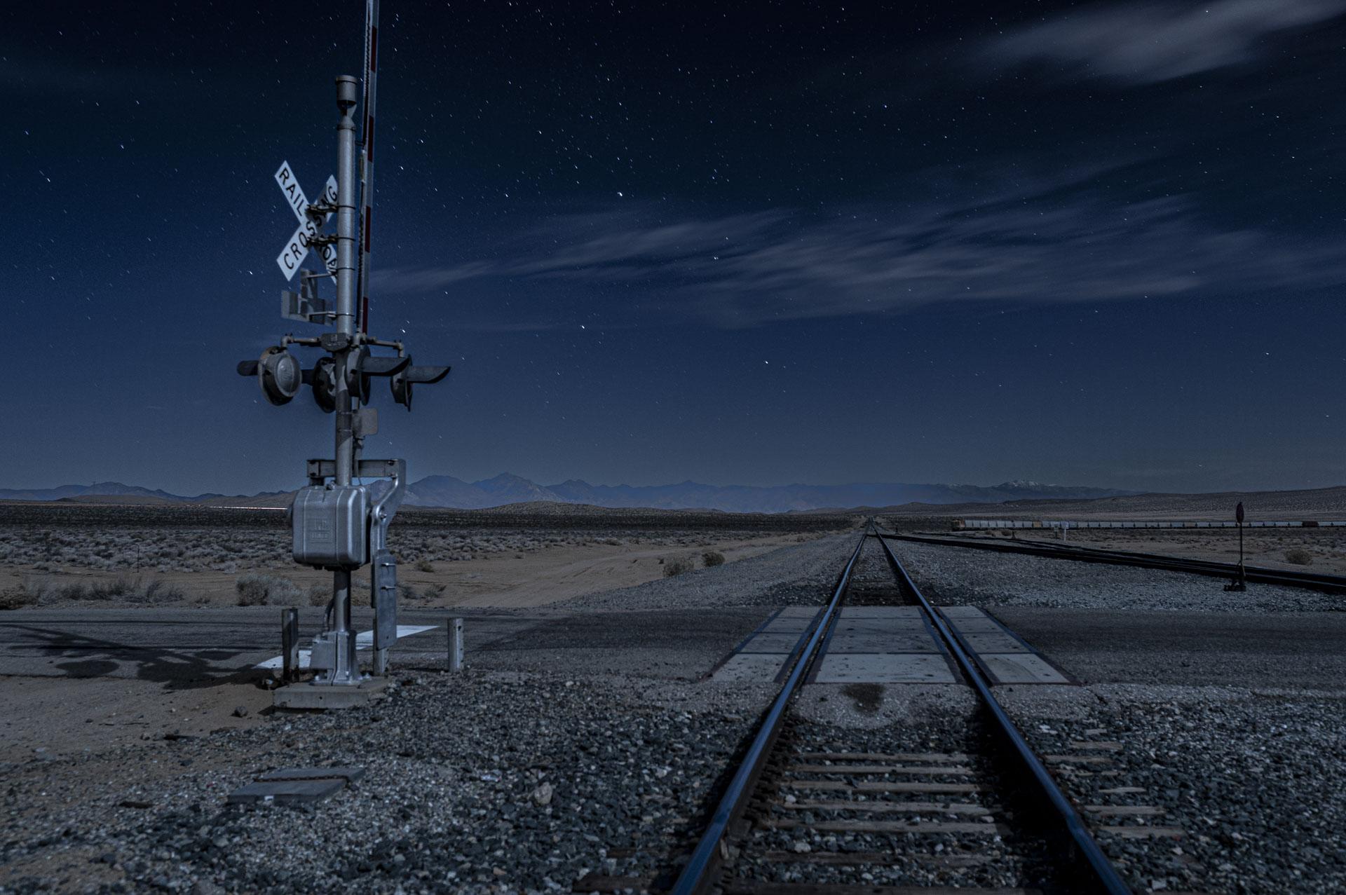
Moonlight is sometimes a realistic source – I shot this still photo in the desert under real moonlight.
 March 24, 2023 at 11:40 am in reply to: Shooting everything in Tungsten balance the same as not using an 85 filter? #197554
If you are recording Arriraw on the Alexa, white balance is only metadata anyway. The sensor is naturally “biased” towards preferring daylight, i.e. it is less sensitive to blue so likes light with more blue wavelengths, so when you convert the Arriraw recording to RGB for a 3200K scene, the blue channel is being boosted in comparison to the others to balance the color for 3200K lighting.
If you record log-C with a color temperature selected, then that color temperature is “baked in”, meaning that if you set the camera to 3200K, then the camera is boosting the blue channel to compensate for a lack of blue signal.
So it is a bit like chasing your tail to shoot in daylight with the camera set to 3200K, record log-C, end up with the camera boosting the blue signal off of the sensor and creating a blue-ish daylight scene, and then in post, lowering the blue channel back down to correct the image to daylight-balance. It may turn out OK, but keep in mind that you’d be taking a recording where the blue information was needlessly boosted and then having to lower it again while boosting the red information to compensate. When you bake-in color temperature, it’s more of a WYSIWYG scenario, you only have the colors you see to work with in post. So you have to ask yourself what you are gaining by recording more blue than you need and less red than you want. Unless you actually want a cold day look.
I think film is similar but also different, even if you shoot daylight on tungsten-balanced film (which is film in which the blue layer is faster to compensate for a lack of blue in tungsten light), you are still recording information in each color layer, so red information can be recovered depending on your base exposure.
It often comes down to Theory and Practice. You read, you watch movies, you shoot, and repeat over and over again.
Activity and Reflectivity are key as well, you need time to digest what you’ve learned. Vittorio Storaro once said that after his first feature, he couldn’t find work and spent two years visiting museums and studying art. At first he thought of those two years as lost time, wasted time, but later he realized that these were the most important years of his professional life because they gave him the foundation for the rest of his career.
What’s a vector set? Is this a day scene? Do you have a grid above the set? How big are the windows? What do you want it to look like in terms of mood?
-
AuthorReplies