Filtration or Grade?

Posted on by

Home › Forums › Post & The DI › Filtration or Grade?

  • Creator
    Topic
  • #248611
    ClairePie
    Participant

      Hello!

      I hope you are well.

      I am shooting a project soon in 16mm using 250D in an outdoor daylight environment. The location is a big green field with some green trees, its going to be quite overwhelming electric green. I would like to try to make the scenes warm and minimise the green effect, notably on costumes and skins. I feel it is better to shoot clean with Macbeth colour chart as reference and do the work in the grade. But maybe it is not the best option? Maybe there is filters that can be of use?

      Let me know what you think.

      Thank you very much!


      Claire

    Viewing 2 replies - 1 through 2 (of 2 total)
    • Author
      Replies
    • #248612
      dmullenasc
      Moderator

        Green saturation is easily adjusted in color-correction so I wouldn’t worry about trying to adjust that with a filter (which would be magenta… but then everything gets more magenta). However unwanted or excessive green spill into the shadows or onto faces should be treated on set with flags, negative fill, draping cloth over off-camera greens, etc.

        If your dailies colorist is amenable to doing more than just balancing to the grey card at the head, you could film a sign saying “reduce green channel saturation” as well.

        #251210
        LucaM
        Participant

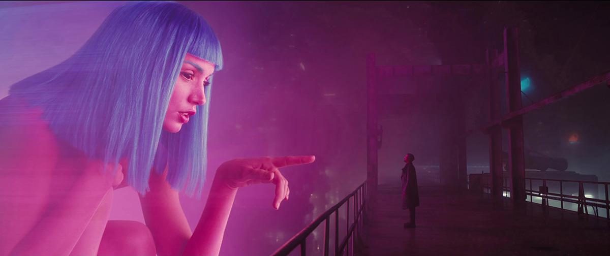
          In my painting years i learned a trick i think it’s useful in such situations. Something like this:

          br

          I don’t mean to put a giant beautiful magenta girl in your shot (even if i don’t see why you should not, ah ah) , i mean that you could make use of contrast between muted and dark areas of the image and saturated bright areas of it to work around a scene in which there’s basically just one color (here it’s almost everything from magenta to a muted blue on Joy’s hair and in that led in the background, even if they look more saturated by contrast, they are quite muted actually). This (wonderful) frame from Roger’s Blade Runner seem way more colorful and saturated than how actually it is, looking at the scopes of it. In your scene the green has the role of the magenta of my example: you could lower the saturation of the greens in your scene but add in it something making a contrast in hue (a little accent of magenta or something like that) or in saturation and brightness (as in the Joy’s scene, the hue of the right part of the scene it’s almost the same of the left part of it, but it’s not a flood of magenta, it’s a very elegant and beautiful effect).

          I apologize if it’s a stupid idea but i hope it can help in some way!

        Viewing 2 replies - 1 through 2 (of 2 total)
        • You must be logged in to reply to this topic.