“Psycho” singles Eye line & Curse of color in modern cinema.

Posted on by

Home Forums Composition “Psycho” singles Eye line & Curse of color in modern cinema.

  • Creator
    Topic
  • #206942
    sanghamithran
    Participant

      Hi , Master Roger

      Hope you are doing well.

      I just recently happened to dig up scenes from the film psycho upon mention of it from an audio book about film.

      I had watched the full movie when I was at college and didn’t observe this while first time viewing, completely terrified by the film, but upon re-watch

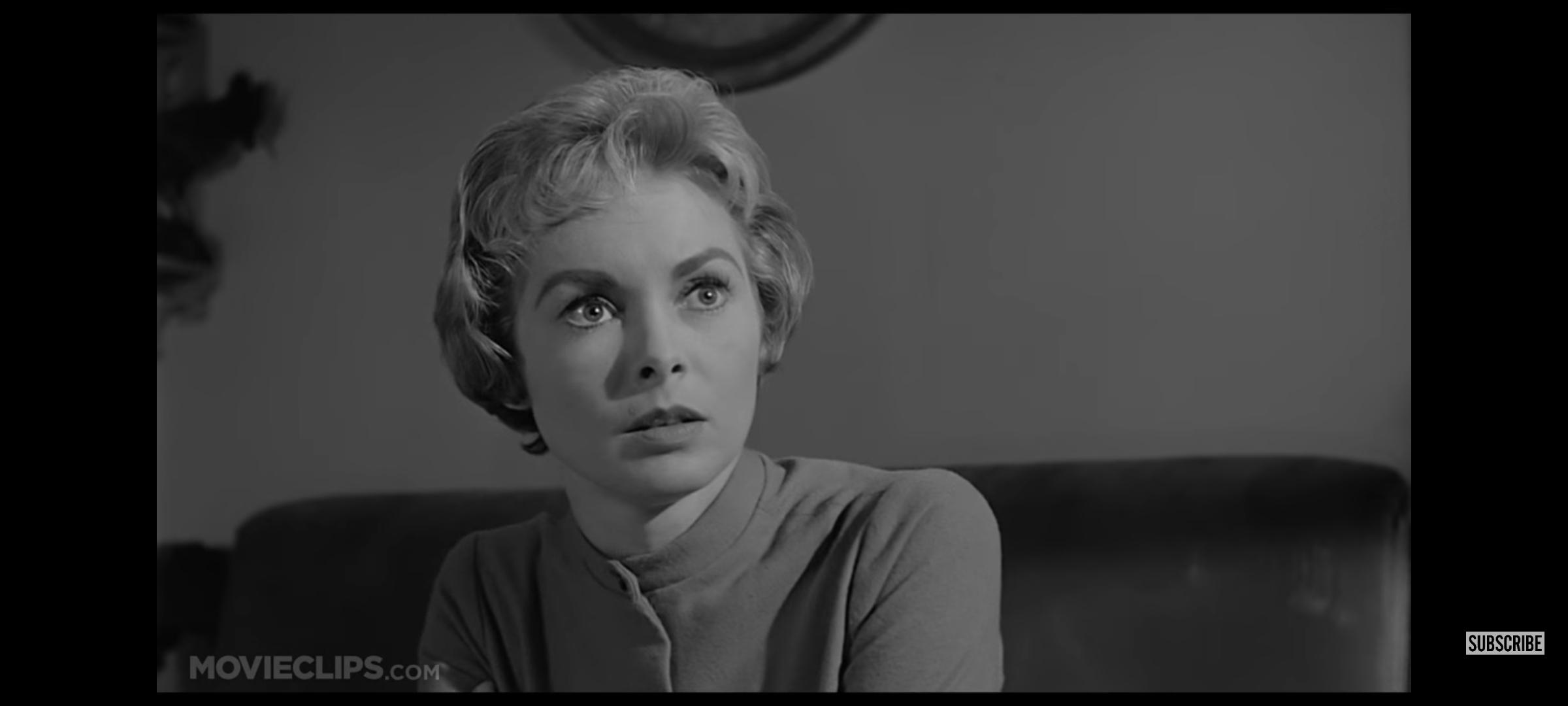
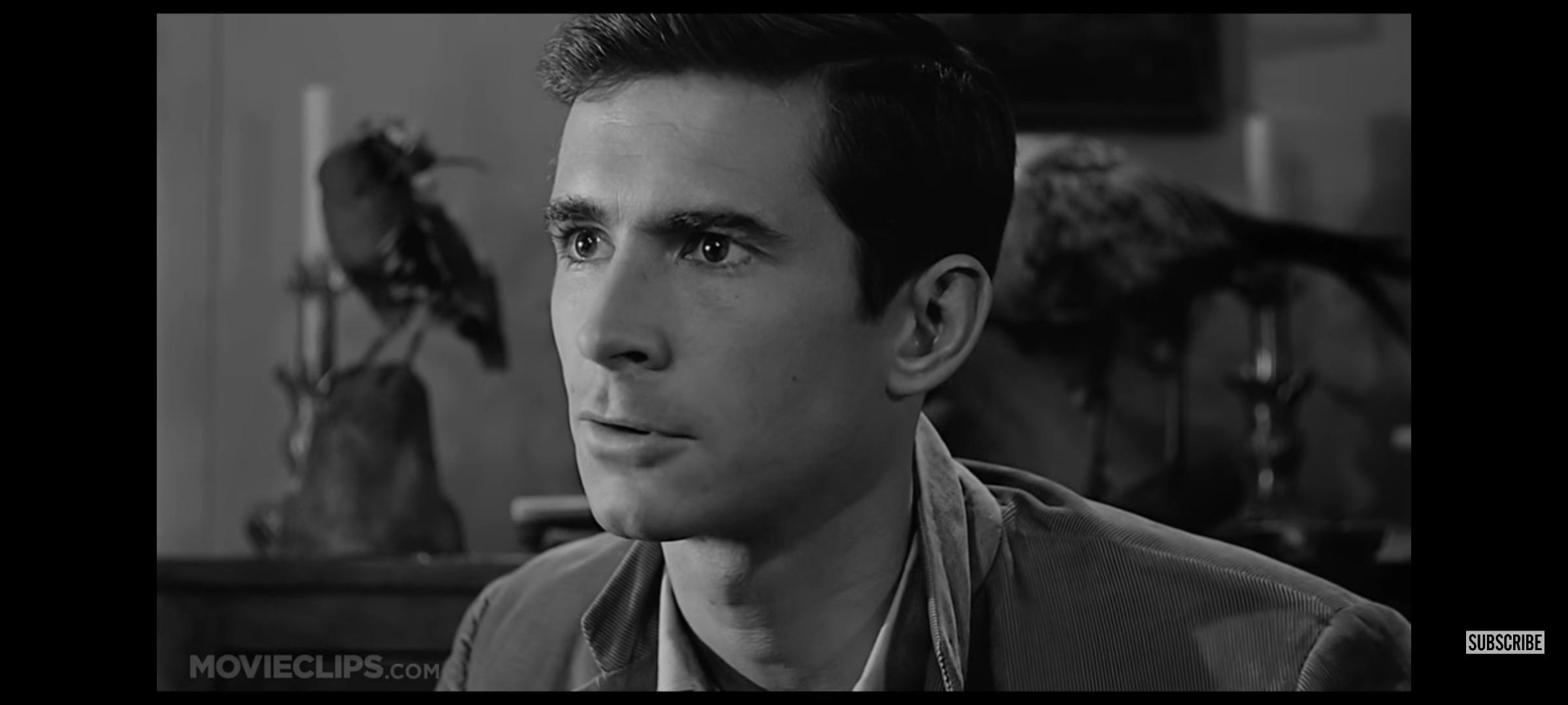
      When I watched one scene it seemed like eye lines are not matching,

      Do you think it is a deliberate choice here or a mistake or maybe i might be overthinking here.

      By looking at the attached images , could you share your opinion on this.

      Also what I noticed is this film had amazing cinematography and thought to myself maybe color is the curse of Modern cinematography just being eye candy rather than the pyschic effect black and white cinematography were able to impart on the audience.

      Do you share any similar thought about modern cinematography?

      Thank you for your kind attention for us and hope you well 🙏🏻.

    Viewing 11 replies - 1 through 11 (of 11 total)
    • Author
      Replies
    • #206944
      sanghamithran
      Participant

        Somewhere I heard , one painter saying color is something that disturbs more than it helps,

        Do you ever feel the same.

        #207113
        GianniRanzuglia
        Participant

          Hi,

          Alfred Hitchcock was famously known and still is, for the way he used editing to create tension and suspense. Mismatching eyelines is a trick he used in Vertigo, North by Northwest, Notorious and Psycho, particularly giving the latter film a sense of danger in the scene you mentioned.


          #207123
          dmullenasc
          Participant

            She has the more direct eyeline because she is the main character, later in the movie he will have the more direct eyeline.

            #207204
            M Ryan
            Participant

              Nice question Sangha, and thanks for the interesting answers Gianni and David.

              ….. and what a lovely pair of frames there! Surely the team that made those beautiful images are doing most everything deliberately 🙂

              #207340
              sanghamithran
              Participant

                Hi, thanks Gianni , Master David and ryan.

                Great learning the eyeline chocies was well intentional.

                Master David could you share your opinion about the color being a distraction part.

                Thank you.

                #208748
                Roger Deakins
                Keymaster

                  ‘Eye candy’. Yes, I think color is often just ‘eye candy’ and both a distraction and an excuse for a lack of something else. On the other hand, there are great photographs as well as films shot in color.

                  As for the eye line. I can’t imagine there is a single shot in ‘Psycho’ that was not deliberate and also drawn out in advance. I’m sure there is a storyboard somewhere.

                  #209313
                  sanghamithran
                  Participant

                    Thank you

                    Master Roger for your feedbacks.


                    #209314
                    sanghamithran
                    Participant

                      Can you mention some of the films that have great color cinematography according to you. Any film with great color work that gave you the level of feeling when you watched a black and white film like psycho .

                      #210881
                      Roger Deakins
                      Keymaster

                        That’s hard! I love B&W and it seems to me that color works in a different way. A color image is obviously far more naturalistic and it is hard to use the same kind of expressionistic lighting using color. Maybe, there can be something equivalent as in ‘Seven’, for instance.

                        #211020
                        Stip
                        Participant

                          I like “Nocturnal Animals” from Tom Ford (fashion designer/filmmaker). From casting (he seems to love to arrange colors around Amy Adams hair) over location to set design and costume, there’s always a delicate combination of colors within a scene/shot. Neither distracting nor driving the story,  just great taste in colors.

                          https://www.youtube.com/watch?v=JOsEU5oYpTA


                          #211113
                          GianniRanzuglia
                          Participant

                            I’d suggest you take a look at the films of Guillermo Del Toro. The way he uses not just colours, but also geometric shapes throughout his films is always justified. In “Pan’s Labyrinth” he contrasts the real and magical world with yellow and blue, he carefully planned out “The Shape of Water” to have a colour palette of aquamarine, cyan and green, which is rarely contrasted with gold (Giles apartment). But in “Crimson Peak,” he only uses the colour red for the ghosts, clay, Lucille’s dress and blood, other than that, we never see the colour red in the rest of the film. These are only a few examples.

                          Viewing 11 replies - 1 through 11 (of 11 total)
                          • You must be logged in to reply to this topic.