- This topic has 4 replies, 5 voices, and was last updated 2 years, 10 months ago by .
-
Topic
-
Hi Sir Roger Deakins (and others),
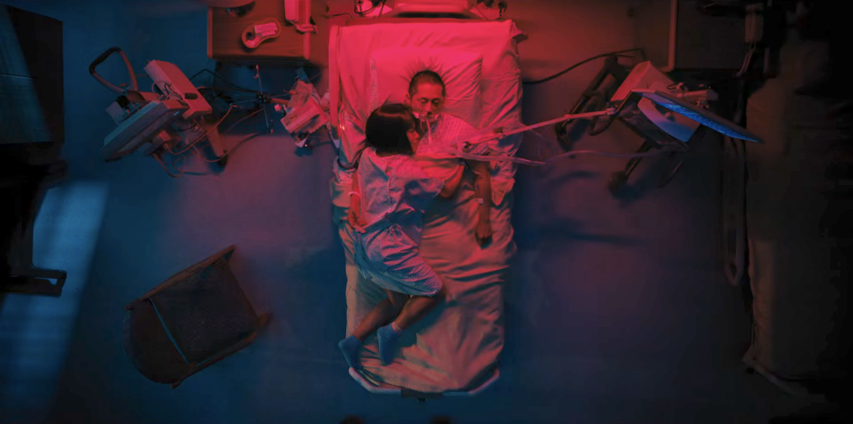
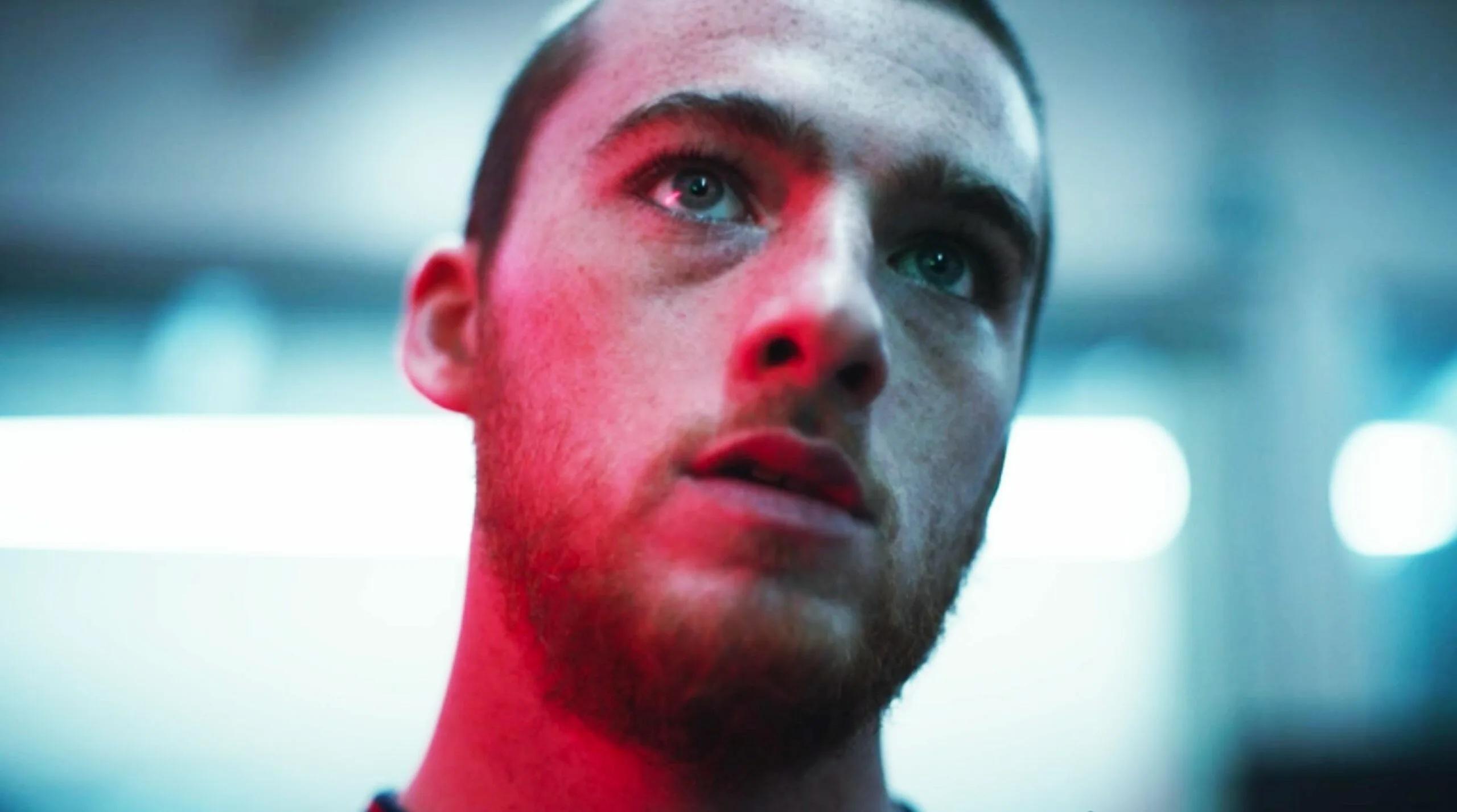
My coworker and I were having a debate after watching an interview/breakdown for the cinematography from the new show Beef shot by Larkin Seiple. Below is a still from a timelapse process shot done near the end of the show. You can find the full shot here as well. There’s just a hodgepodge of colors all over, which honestly is pretty on style for the show, which doesn’t shy away from mixing color temps, or even just using multiple aggressive colors to light the subjects. We also thought of another shot (put below) from Marcell Rev’s Euphoria. That show also has plenty of insane color or camera moves throughout, but the still below we thought was actually a really good use of red. It’s still very prominent, but still toned down with the cool white light surrounding it.
It’s easy to point at flashy colors and say, “Hey that doesn’t serve the story it doesn’t work!” But you can also have something that does serve the story, but it’s still too much. From the other threads and what I’ve read I know you are much more restrained in your use of color, and even find it a nuisance. But color, and aggressive use at that, can have its place. If this line of what’s considered distracting is different for everyone is it just something you need to make a personal decision on as an artist? How do you look at your work with a fresh eye and make sure your work is all in service of the story? If the lighting or camerawork is “intense” is that always a bad thing? There have been entire painting movements based around shifting the focus to technique or style or color over the story attached to the piece. Or is that not a fair comparison?
I would love to hear everyone’s thoughts! Thank you so much for your time!


- You must be logged in to reply to this topic.
